Connecting Sky customers to the content they love
Helping Europe’s leading entertainment brand improve several high-profile digital products.
My role: Senior UX Designer (contract)
Research, design, prototyping, workshops
2018 to 2019
Sky’s services are used by 24 million customers to access news, entertainment, arts, and sports. I had the opportunity to work with several product teams from across the company.
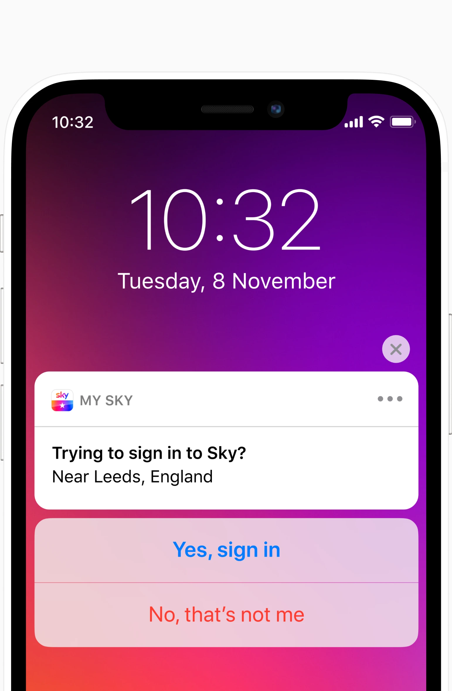
Sky ID
Sky ID connects customers to TV, mobile apps and web content. My work with the Sky ID team focused on simplifying the log-in experience, while enhancing account security.
Analysis of existing user journeys revealed several opportunities for improvement. We set goals to:
- reduce the number of sign-in prompts
- explore password-free approaches
- analyse voice authentication methods
- frame two-factor authentication in a way that users understand
- provide new customers with a simpler onboarding process
- improve user management for households, rethinking the existing permission-based model
- reimagine profiles for children
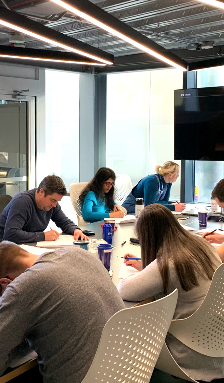
Customer-facing concepts needed to be intuitive. I designed prototypes and conducted user research at Sky’s dedicated user research lab. Concepts were evaluated based on usability, perception, and benefit understanding.
The result of our exploration and iterations was a set of design recommendations we felt confident presenting back to senior stakeholders.
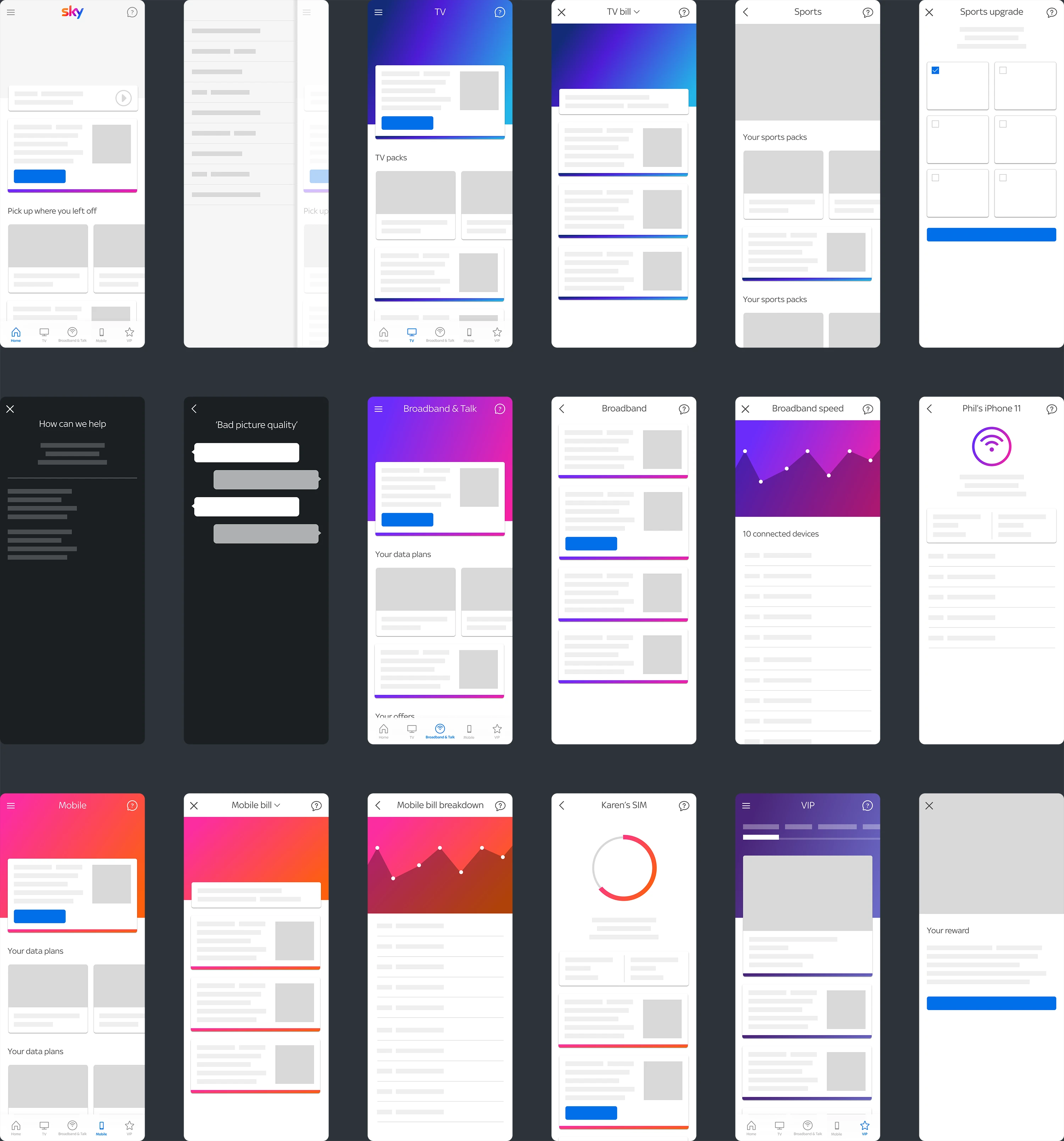
My Sky app
The My Sky app is a mobile companion for all Sky services. Customers can manage their account, pay bills, and access Sky’s content library. The app encompasses TV, mobile, and broadband. It’s also home to Sky VIP, the company’s loyalty program.
In some ways, the first version of the app was a victim of its own success. The scope of the app had grown organically over time and features were hidden. We had the chance to reinvent the app for version 2, with the benefit of insight into how customers had been using it.
Goals were set to:
- rethink the information architecture and navigation
- encourage habitual usage
- make the experience feel personal
- establish a new, accessible design system
- increase customer uptake of the VIP programme
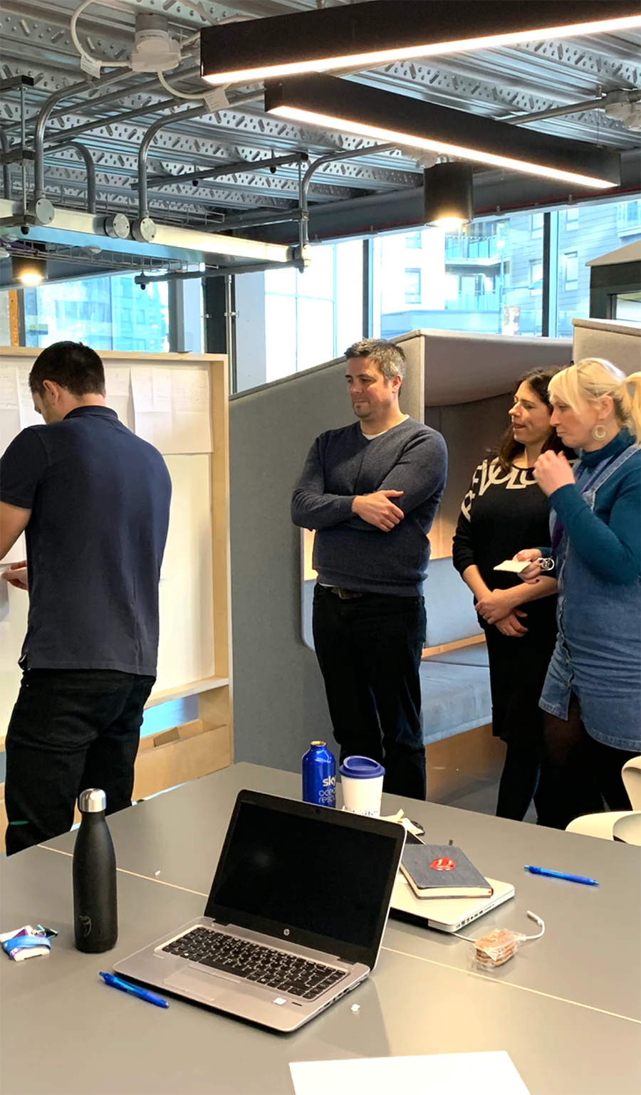
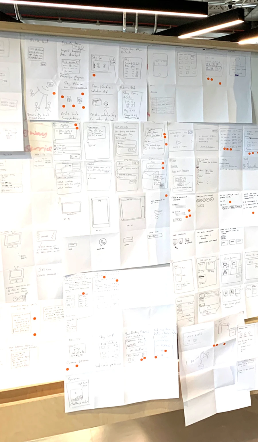
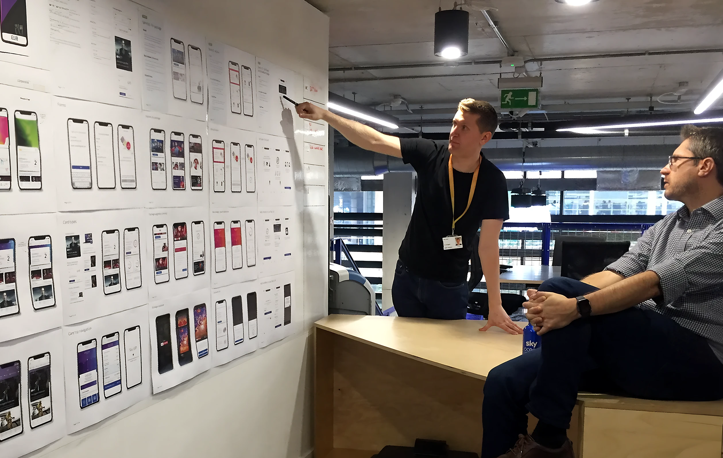
I was part of a team of designers who worked on the redesign. It was an ambitious project with a wide scope and many stakeholders. A careful and structured approach was essential to maximise our time.
We followed a similar process to the Google design sprints, bringing a cross-disciplinary team with different perspectives together to discover, ideate, prototype and test with users. In total we ran about 10 of these design sprints, each focusing on a different area of the app. Developers were involved from the start and helped throughout the ideation and prototyping stages.
After several weeks of intensive design sprints, we had plenty of insights. We had rough prototypes for all areas of the app; some that had tested more successfully than others. It was then time to prioritise a backlog and continue to iterate and refine the design as development work began.
Version 2.0 of the My Sky mobile app was released in March 2020. It’s had millions of downloads and achieved an improved App Store rating of 4.5 stars.
Phil is invaluable when developing early concepts, undertaking iterative R&D and showcasing to executives. It’s a pleasure working alongside such a collaborative user-centred designer, producing well-rounded products that people love.
Rich Thomas
Senior Product Owner, Sky
