A mobile-first endsleigh.co.uk
A complete overhaul of Endsleigh’s online presence, including digital transactions and a visual rebrand, helping Endsleigh maintain its position as one of the UK’s leading insurers.
My role: Design lead
Design, information architecture, prototyping
2013 to 2014
As part of a discovery phase, Endsleigh asked Erskine Design to explore what its website might look like if it were redesigned to work across different devices. We created a prototype to demonstrate potential approaches. We were subsequently selected as the design partner for a comprehensive redesign of endsleigh.co.uk.
Our approach
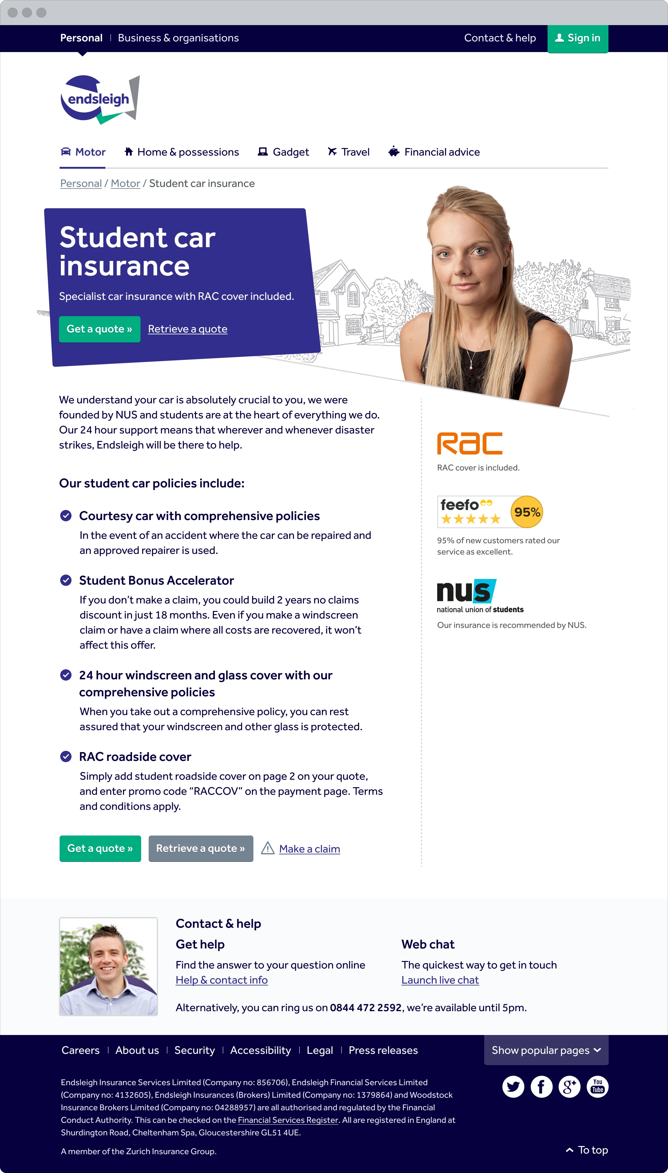
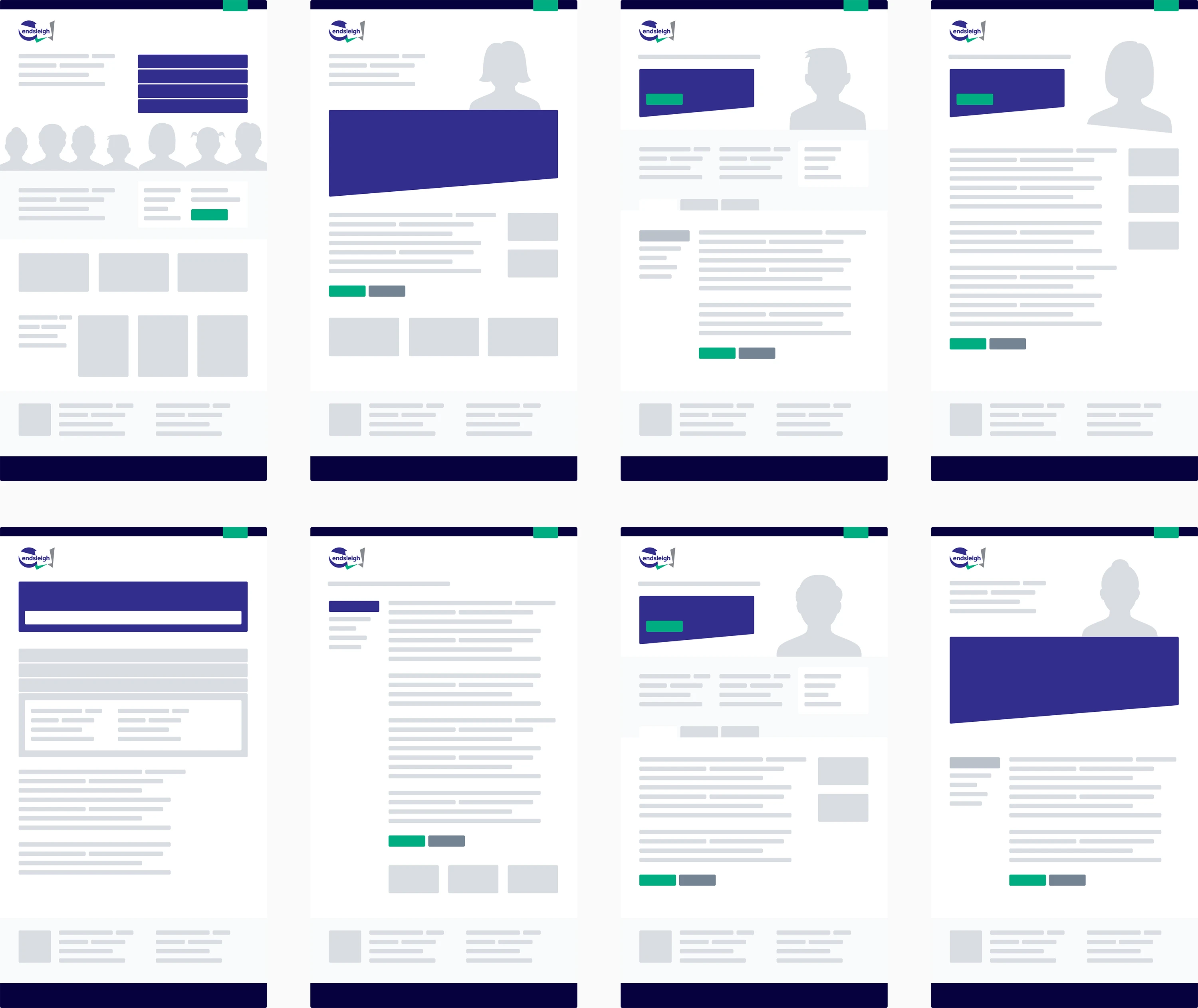
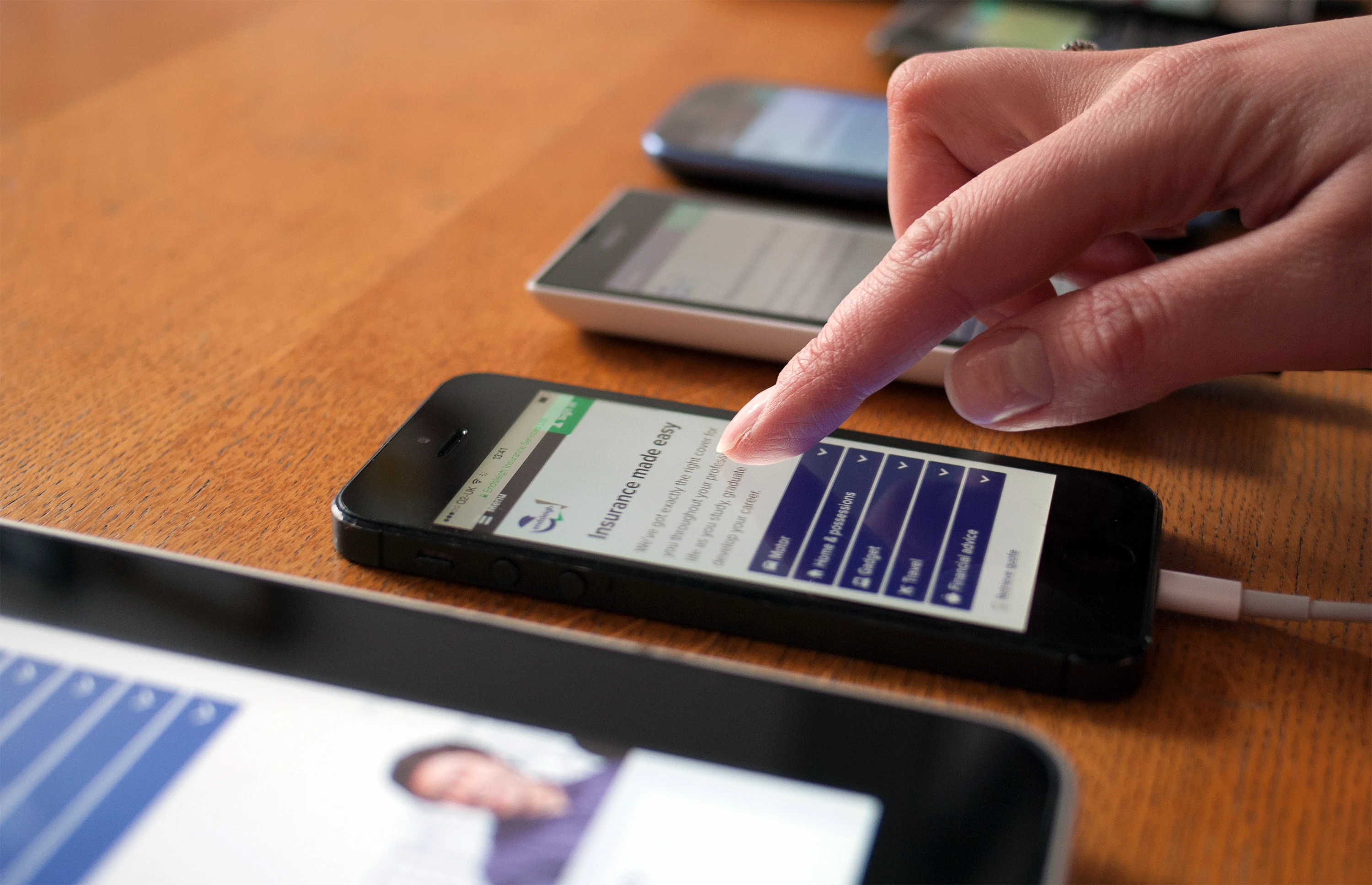
We started by focusing on the experience for small-screen users. This challenged us to strip back the content and consider how limited screen space could accommodate product information, sales messaging and calls to action.
Our initial designs needed to be validated. Endsleigh has a deep understanding of their customers and provided valuable insight on the goals and frustrations of users.
We then conducted a full content audit, identifying different content types and patterns. We could then define page types to accommodate this content. Examples include:
- product category pages (motor insurance)
- product pages (student motor insurance)
- product category explainers (about motor insurance)
- customer group pages (insurance for students)
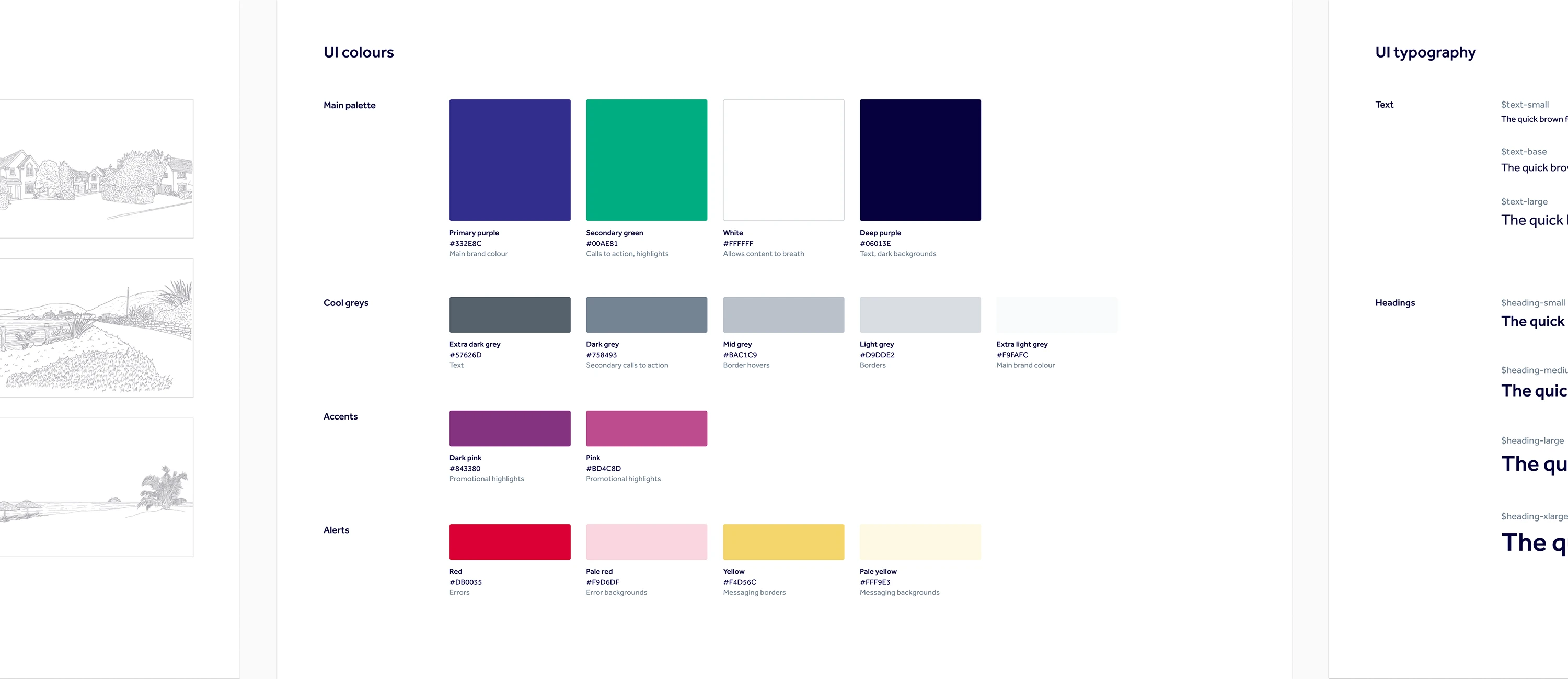
As Endsleigh has several editors and a large amount of content, we limited the scope of authoring tools and developed a style guide to encourage consistency. This helped ensure the codebase would be maintainable in the future.
A visual refresh
Endsleigh was keen to maintain its distinctive brand identity. We took a functional approach to the visual design. We used the brand colours to bring emphasis and contrast to areas where needed. Greyscale line drawings combined with photography prevented banners and promotions from competing with the main sales messaging and allowed calls to action to stand out.
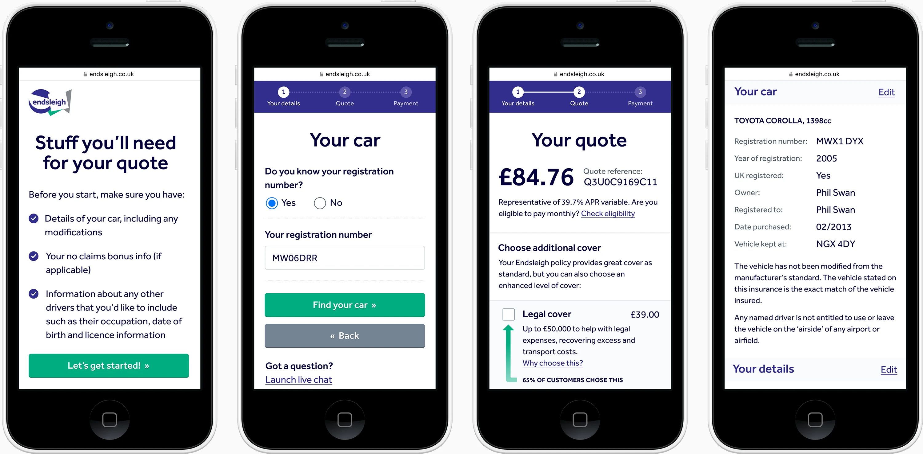
Quote journeys
The mobile-first approach also applied to forms. To improve usability, these became clear step-by-step layouts. We worked with agency, Mark Boulton Design who conducted user research and helped to shape the user experience for student and graduate insurance products.
Outcomes
As a result of the new design, Endsleigh has seen an increase in traffic and conversions. An additional benefit has been an improvement to the editing experience for staff.
Our redesign and the resulting improvements to performance led to:
- 20% drop in bounce rates for tablet users
- 40% increase in conversion rates for key products
- 15% drop in the number of calls to their customer service centre
- further work adapting designs for the customer account for Endsleigh’s parent company, Zurich
I’ve worked with Phil for seven years across a range of challenging projects. He has never failed to deliver on time and budget. He’s not afraid to challenge where necessary and always adds a great deal to any project he’s working on.
Iain Harper
Head of Digital & Brand, Endsleigh
